|
I learned a lot about typography this quarter. The meaning of typography is like the appearance or look of a printed text. It is designed to look more appealing. Such as different font and styles for text. "Each font has a personality and purpose." I think this quote is talking about how different texts have different uses depending on how they are designed. For example, comic sans has a really childish look and appeal making it good to use in things like comics or childish things. But it would be unfitting for a hospital. We learned about Serif, Sans serif, monospaced, handwriting and novelty. Serif is text with feet. Probably used for formal letters and projects. Sans serif is serif but without feet. Used for casual things like sending a text. Monospaced is where each letter takes up the same amount of space. You can use monospaced but it is hard to read and I guess it looks cool. Handwriting is where the letters are connected. And novelty is a special type of font that doesn't fall into any category. typeface comparisonin this activity we got the different types of fonts and wrote the same sentence 5 times in different fonts and types of text. 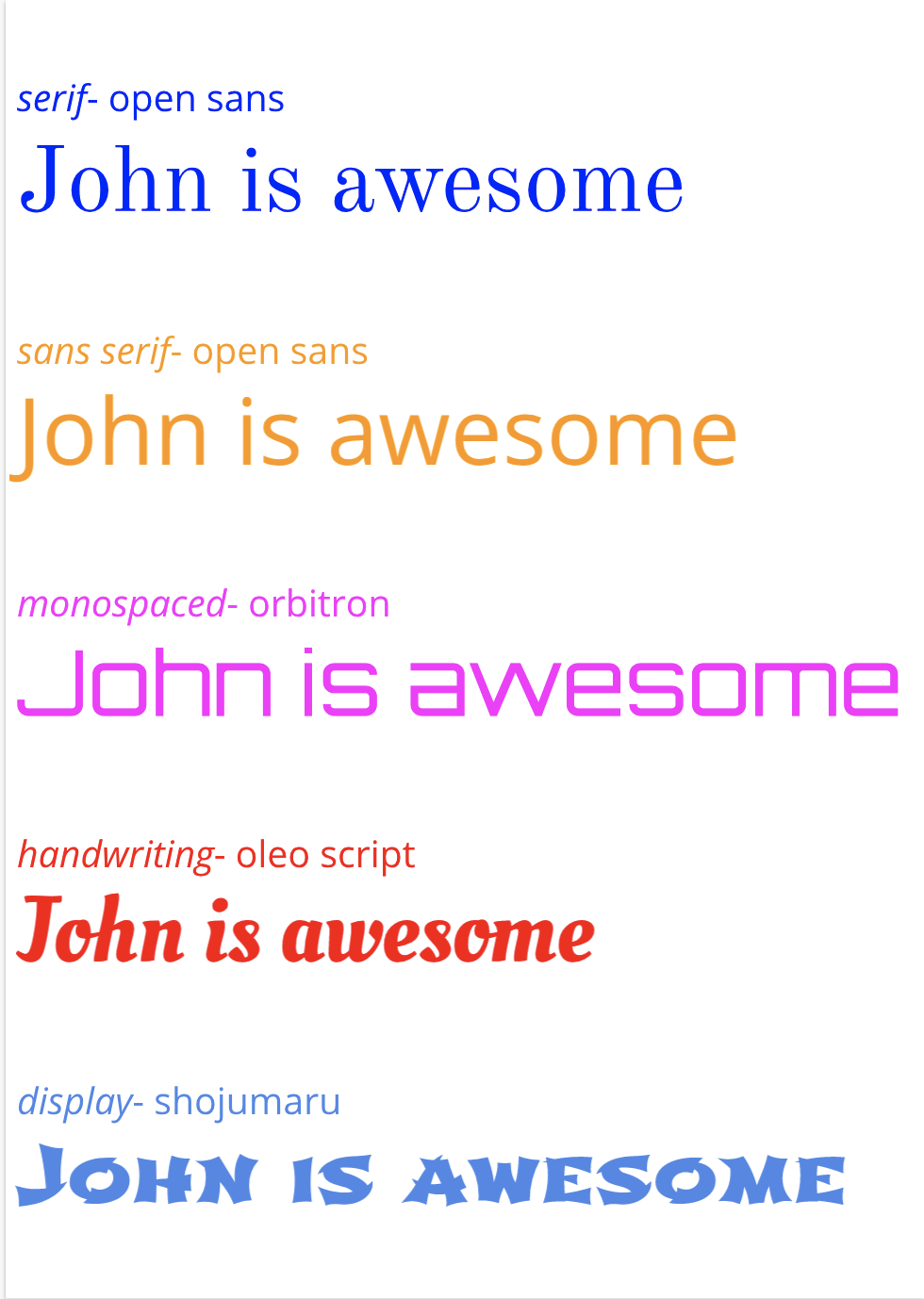 word portraitsin this activity we had 10 different fonts and wrote words that matched the font and a word that didn't match the font. 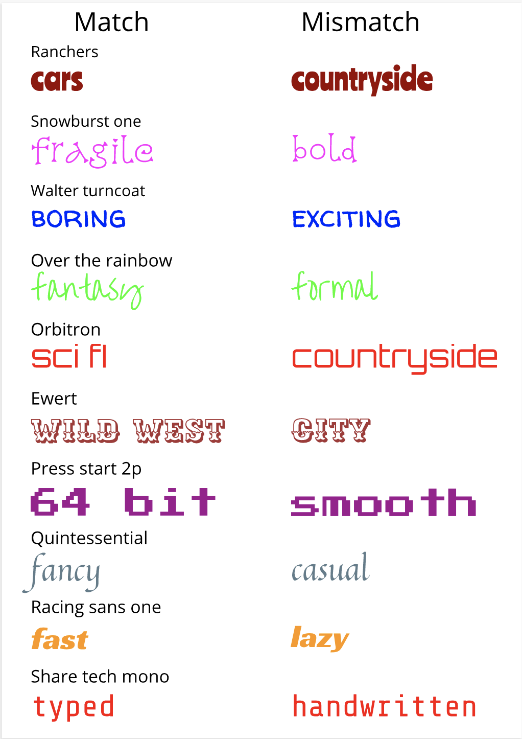
0 Comments
Leave a Reply. |
AuthorI like video games and eating food. ArchivesCategories This work is licensed under a Creative Commons Attribution-NonCommercial-ShareAlike 4.0 International License. |
