|
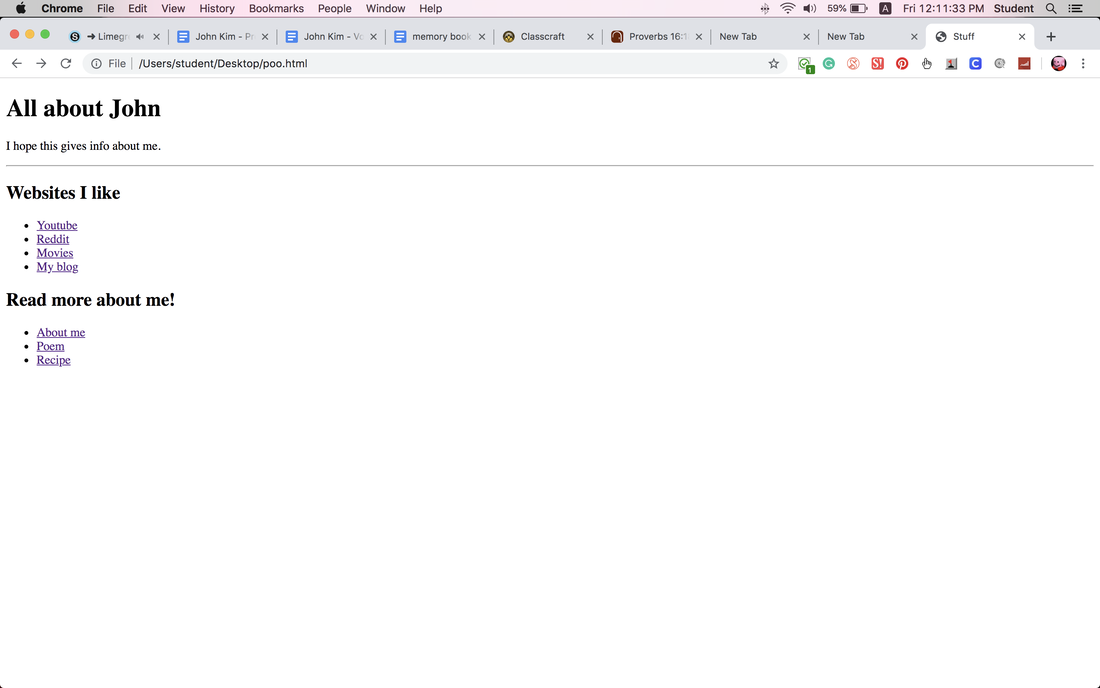
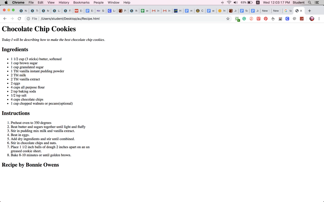
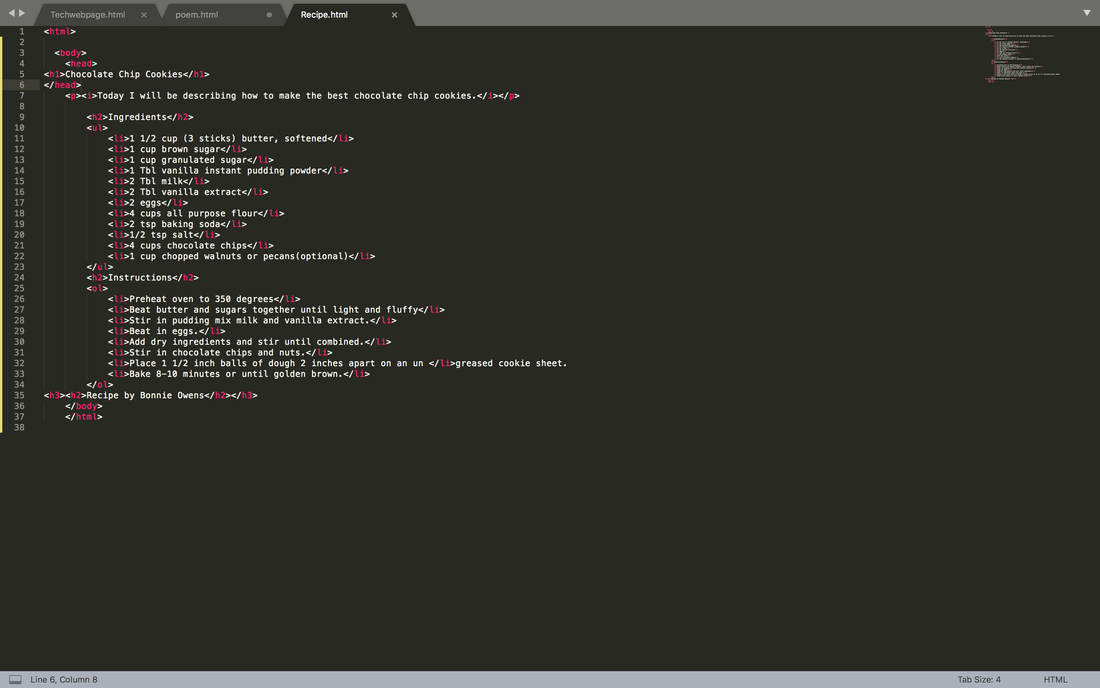
Today I used more tags to create a poem with Sublime text. 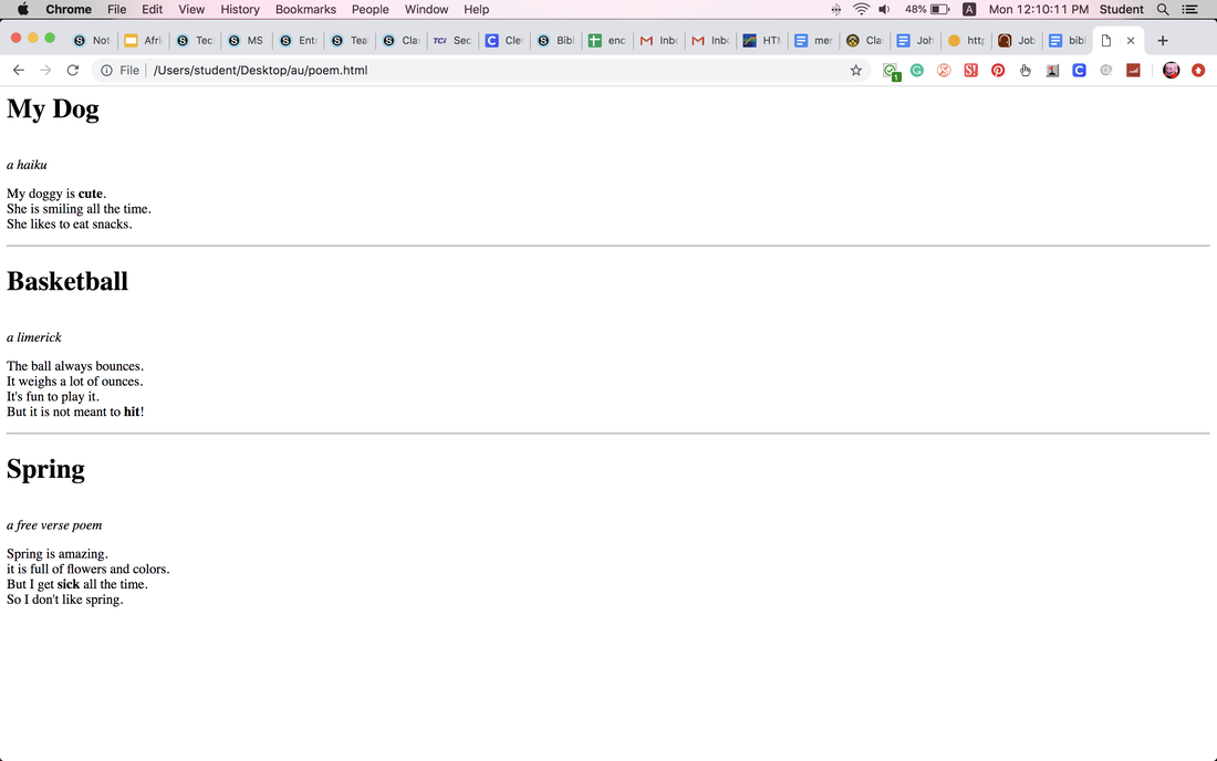 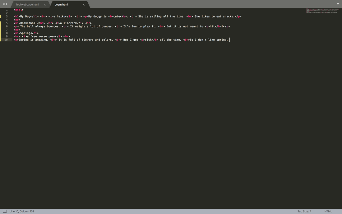 In this assignment, I programmed a website where I talked about video games with Sublime text. 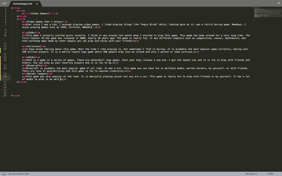 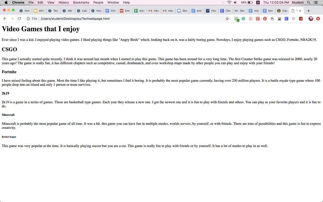 We were supposed to choose three logos that we liked and vectorize it. After we had finished vectorizing our logos, we made 3 different variations of the design. We were supposed to change color themes, fonts and size. Things like that. A challenging thing in the process was thinking of different variations. I had to really think to change things rather than just the color. My favorite thing was vectorizing the logos. It was cool to vectorize something that I had drawn. I learned how to wrap text so that it is curved. 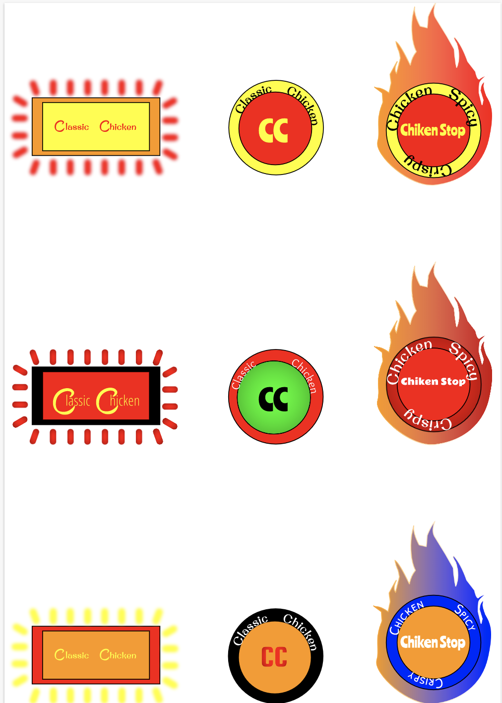 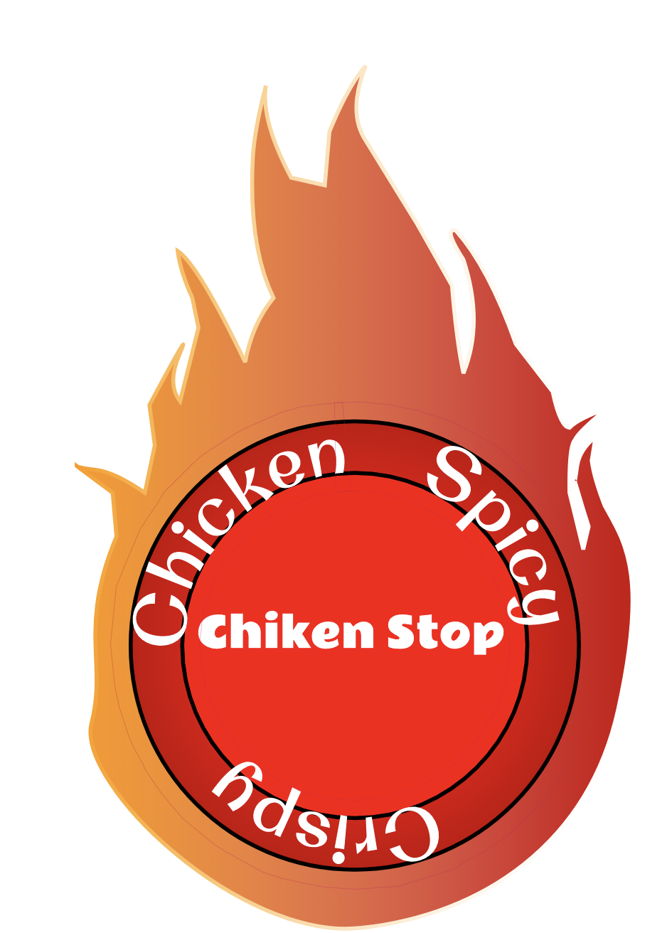 We were supposed to give 5 examples of 4 different color schemes. I used a bear. We used the website Abode Color to get the different colors. Monochromatic is the same hue but different shades and saturation. Analogous is different hues spaced out evenly on the color wheel. Triad is 3 different hues evenly spread out on the color wheel. Complementary is hues on opposite ends of the color wheel. I like monochromatic because it looks similar and clean together. I think spacing everything neatly was challenging. Bear source 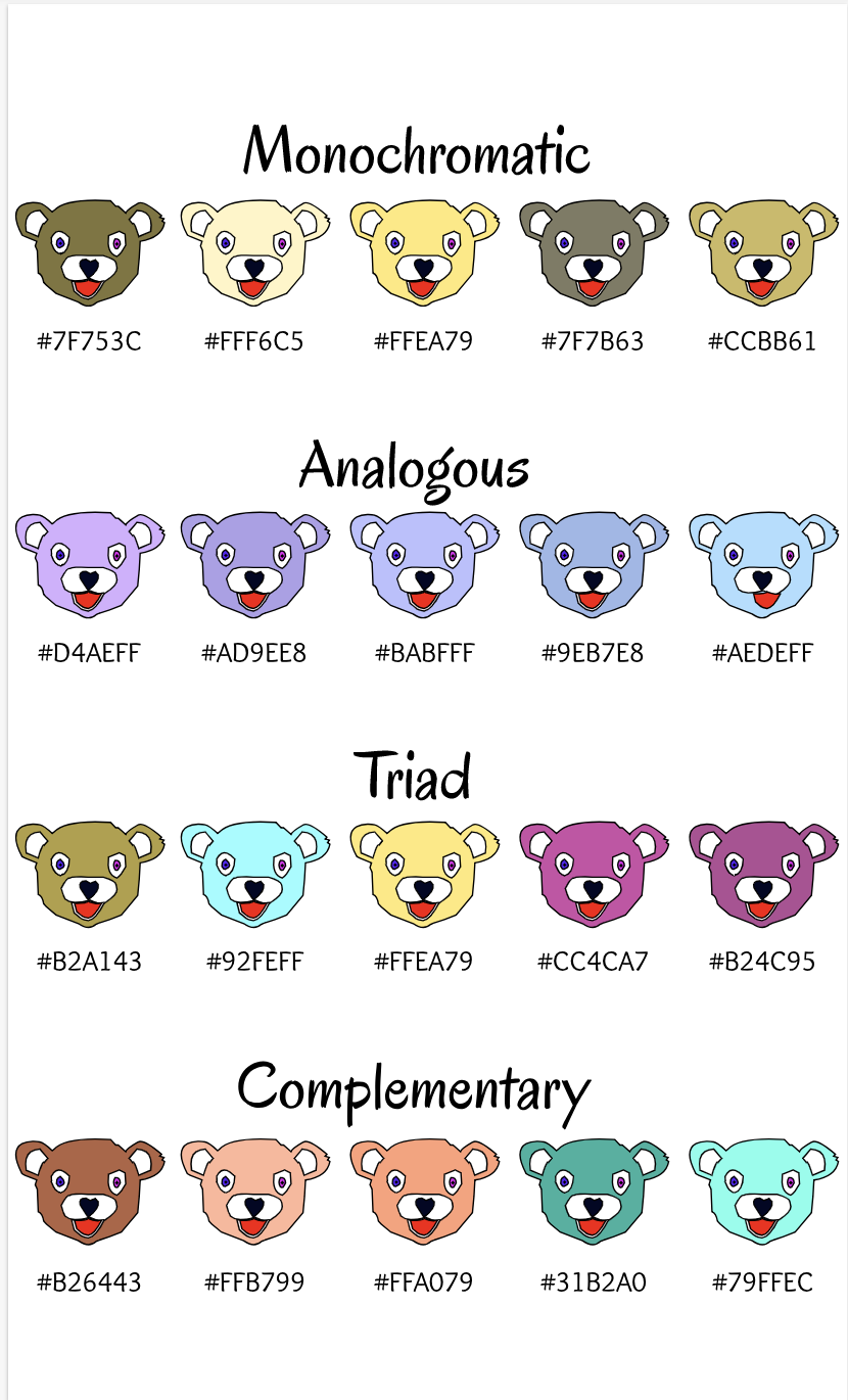 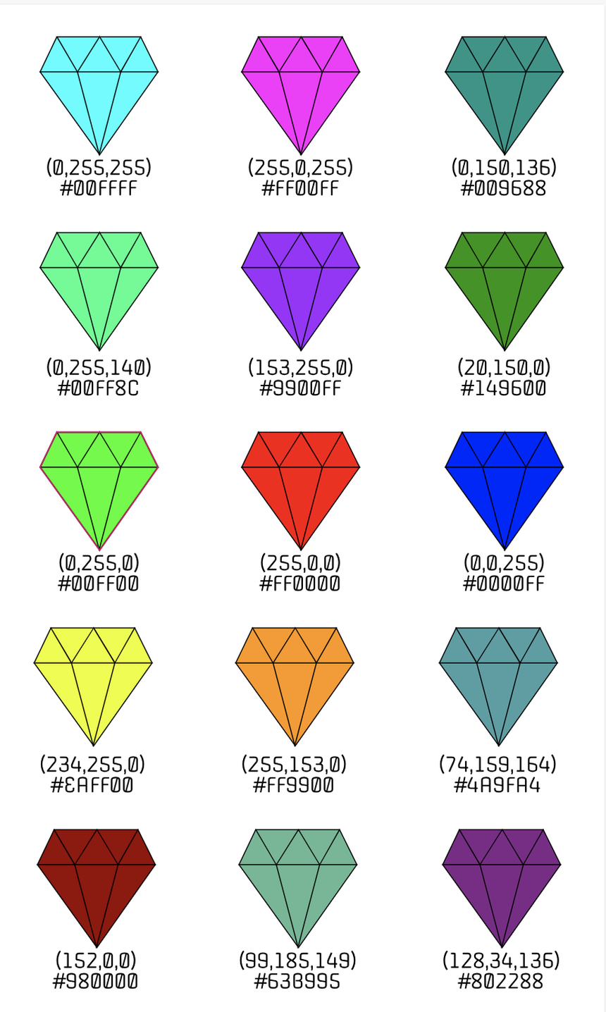
diamond original picture I learned a lot about typography this quarter. The meaning of typography is like the appearance or look of a printed text. It is designed to look more appealing. Such as different font and styles for text. "Each font has a personality and purpose." I think this quote is talking about how different texts have different uses depending on how they are designed. For example, comic sans has a really childish look and appeal making it good to use in things like comics or childish things. But it would be unfitting for a hospital. We learned about Serif, Sans serif, monospaced, handwriting and novelty. Serif is text with feet. Probably used for formal letters and projects. Sans serif is serif but without feet. Used for casual things like sending a text. Monospaced is where each letter takes up the same amount of space. You can use monospaced but it is hard to read and I guess it looks cool. Handwriting is where the letters are connected. And novelty is a special type of font that doesn't fall into any category. typeface comparisonin this activity we got the different types of fonts and wrote the same sentence 5 times in different fonts and types of text. 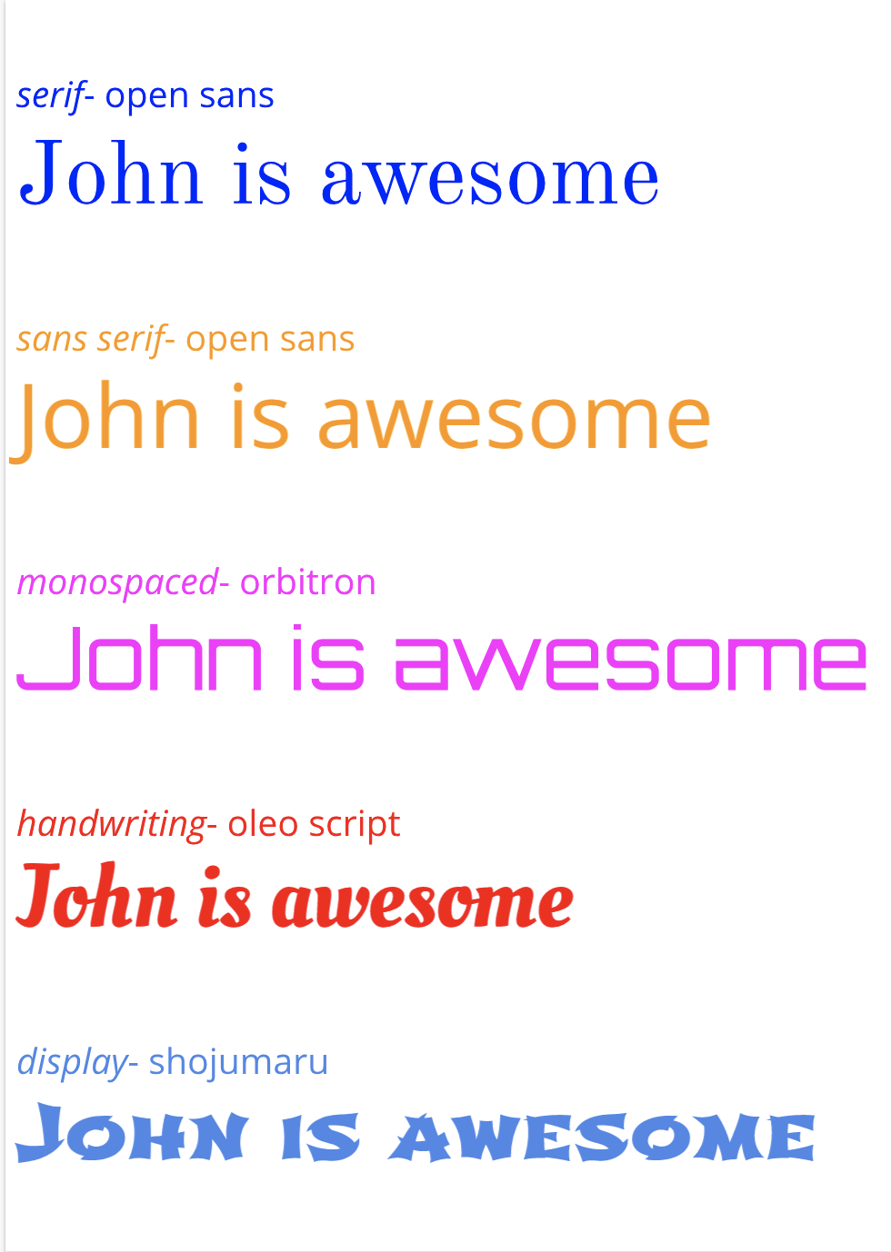 word portraitsin this activity we had 10 different fonts and wrote words that matched the font and a word that didn't match the font. 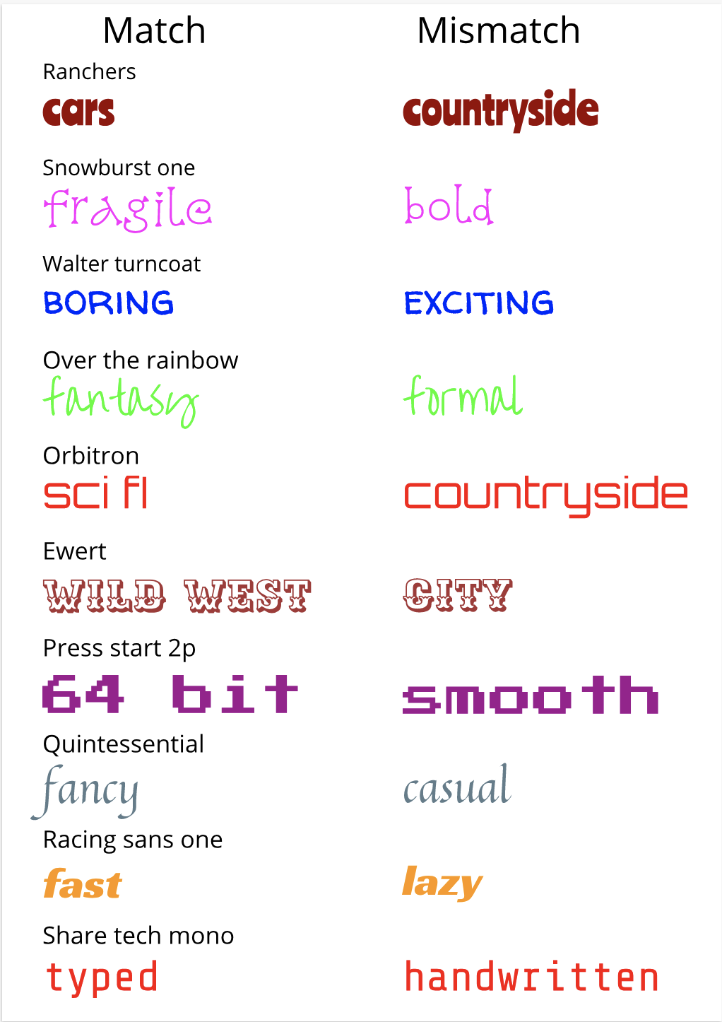 |
AuthorI like video games and eating food. ArchivesCategories This work is licensed under a Creative Commons Attribution-NonCommercial-ShareAlike 4.0 International License. |